Design Philosophy
How do you create a cohesive interior design? Design decisions on materials, art, and spatial proportions
It’s not about choosing everything in the same style, but giving each element its own place in the space.
When planning a home, it’s easy to fall into this situation: you love a sculptural accent chair and richly textured natural stone. By the time you’ve made your selections, each piece looks beautiful on its own, but together they make the space feel crowded or compete for attention. By contrast, some spaces use wood, metal, stone and art all at once, yet still feel visually cohesive. The difference often isn’t how many materials are used, but how they establish hierarchy, proportion and visual flow.
To understand the overall feel of an interior, there’s no need to rush into choosing a style label. Instead, start by answering a few questions in order: What do you see first when you enter? What takes center stage? Do the textures and finishes of different materials compete with one another? Is the artwork tucked into a corner, or does it work with the furniture, walls and lighting to create an experience of viewing?
In past interviews, Steve Leung has noted that residential design must address everyday needs, emotional value, and aesthetics—and that art, furniture, and space should not be pieced together as an afterthought. This offers a starting point for understanding “cohesion,” but what matters most are the design choices that can be observed and explained.
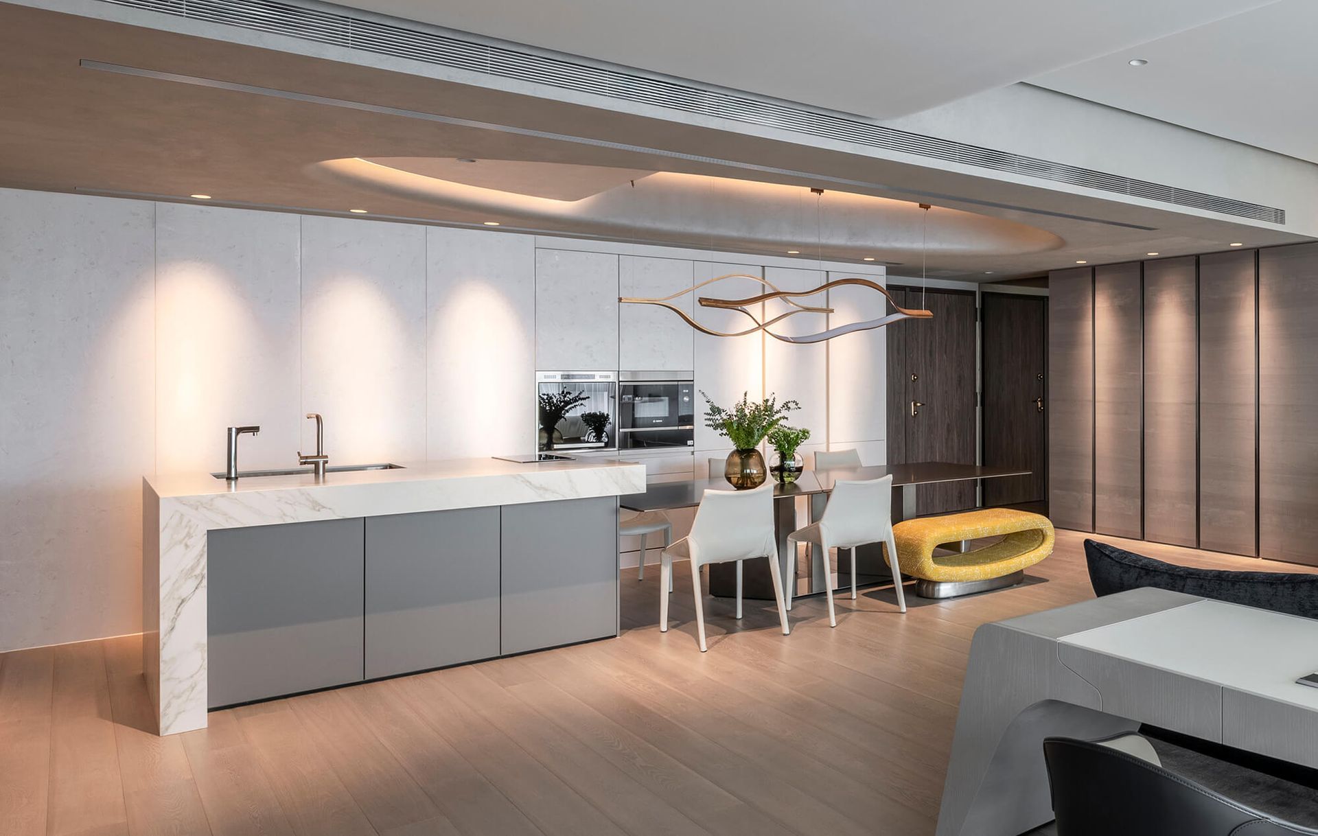
01|Start with a visual focal point to create cohesion—not every corner needs a highlight
Imagine a living room with a strongly veined stone feature wall. Add a high-contrast rug, polished metal, a boldly patterned sofa, and several sculptural pieces, and the eye may keep jumping between elements. The designer’s task is not to decide which piece is lacking, but to assess whether too many equally strong focal points have been placed within the same sightline.
One approach is to keep the feature wall as the visual centerpiece, while toning down the contrast of the surrounding woodwork, textiles, and lighting to create a backdrop. Alternatively, if the artwork is the focal point, a more understated wall finish may work best, or negative space and lighting can help draw attention to the piece. These aren’t fixed color formulas; they’re decisions guided by the viewing sequence.
When reviewing a space, try looking at it from the entrance, the main sofa seat and the dining area. Does each viewpoint have a clear focal point? If the space feels more complete without one bold decorative piece, it may not need to be there.
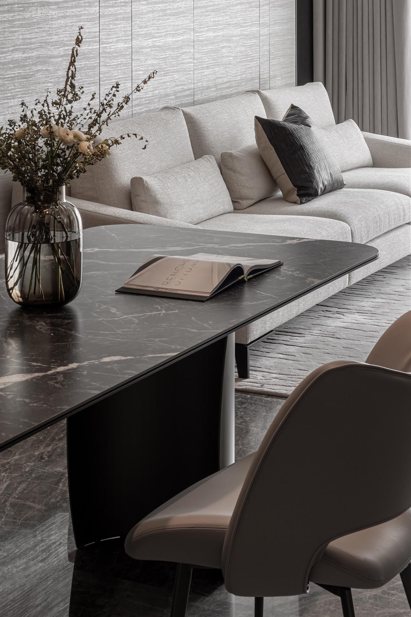
02 | How to combine materials: establish a hierarchy before bringing in stone, wood, metal and textiles
Material pairing is often mistaken for “playing it safe with the same color palette.” Yet even within ivory tones, honed stone, polished stone, wool, and lacquered panels differ greatly in how they reflect light and feel to the touch. What truly needs to be coordinated is the density of the textures, the sheen of the surfaces, the scale of the objects, and where they are placed.
For example, when a large wall is finished in richly patterned stone, choose woodwork or fabrics with calmer grain for the other key furnishings. This gives the space depth without making it feel busy. If the overall palette is quiet and muted, a dark piece of furniture or a small metallic detail can add contrast without making every material compete for attention.
Materials also differ in how they work in everyday life: a dining table is touched every day, walls are mainly viewed, and a sofa needs to support the body and invite people to linger. Each location calls for different considerations in feel, maintenance, and visual impact. So a successful mix is about more than a color palette—it also needs to reflect how each material will actually be used.
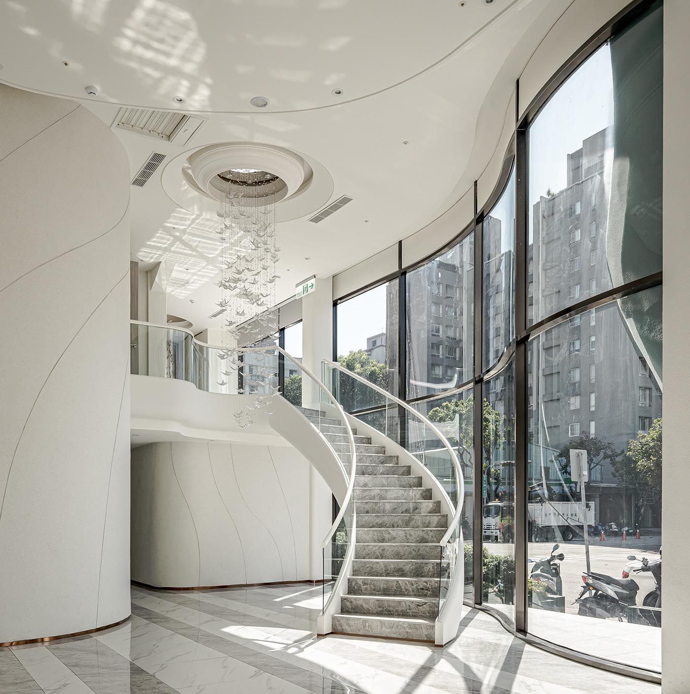
03 | How to place artwork: start with viewing distance and sightlines, not just wall size
The placement of art influences how people move through and pause within a space. A painting at the end of a corridor becomes a visual destination along the way. Above a sofa, it needs to be considered in relation to the sofa’s scale, viewing height, and the negative space around it. A large suspended work in a stairwell or double-height space calls for careful consideration of proportions from different levels and viewpoints.
The staircase and suspended artwork at Taichung Yayuan offer a useful perspective: the artwork is not merely an object in the space; it is experienced together with the curve of the stairs, the double-height ceiling, and the natural light from the windows. A close-up of the artwork alone would make it harder to understand why it belongs there.
A typical home doesn’t need to replicate the same scale; what it can borrow is the order of decision-making. First consider where people stand and sit, and which direction they enter from; then determine the artwork’s size, placement, and lighting. Art should be supported by the space, not by adding more pieces to prove that it has an artistic feel.
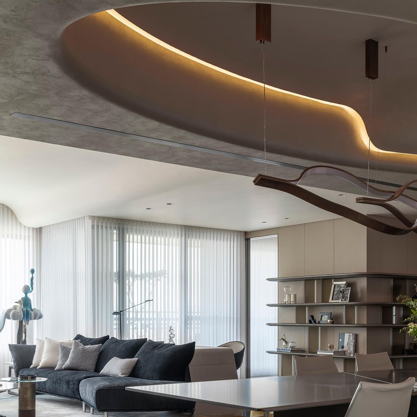
04|Curves, symmetry or minimalism: how do you use them without turning them into copy-and-paste style clichés?
Curves can soften transitions, carry the eye through a space, and create a sculptural rhythm. Symmetry can establish order, but that doesn’t mean every door and piece of furniture has to match. Minimalism can reduce visual distractions, but it doesn’t mean everything must be hidden away. The effect of each approach depends on where it is used and how it relates in scale to the elements around it.
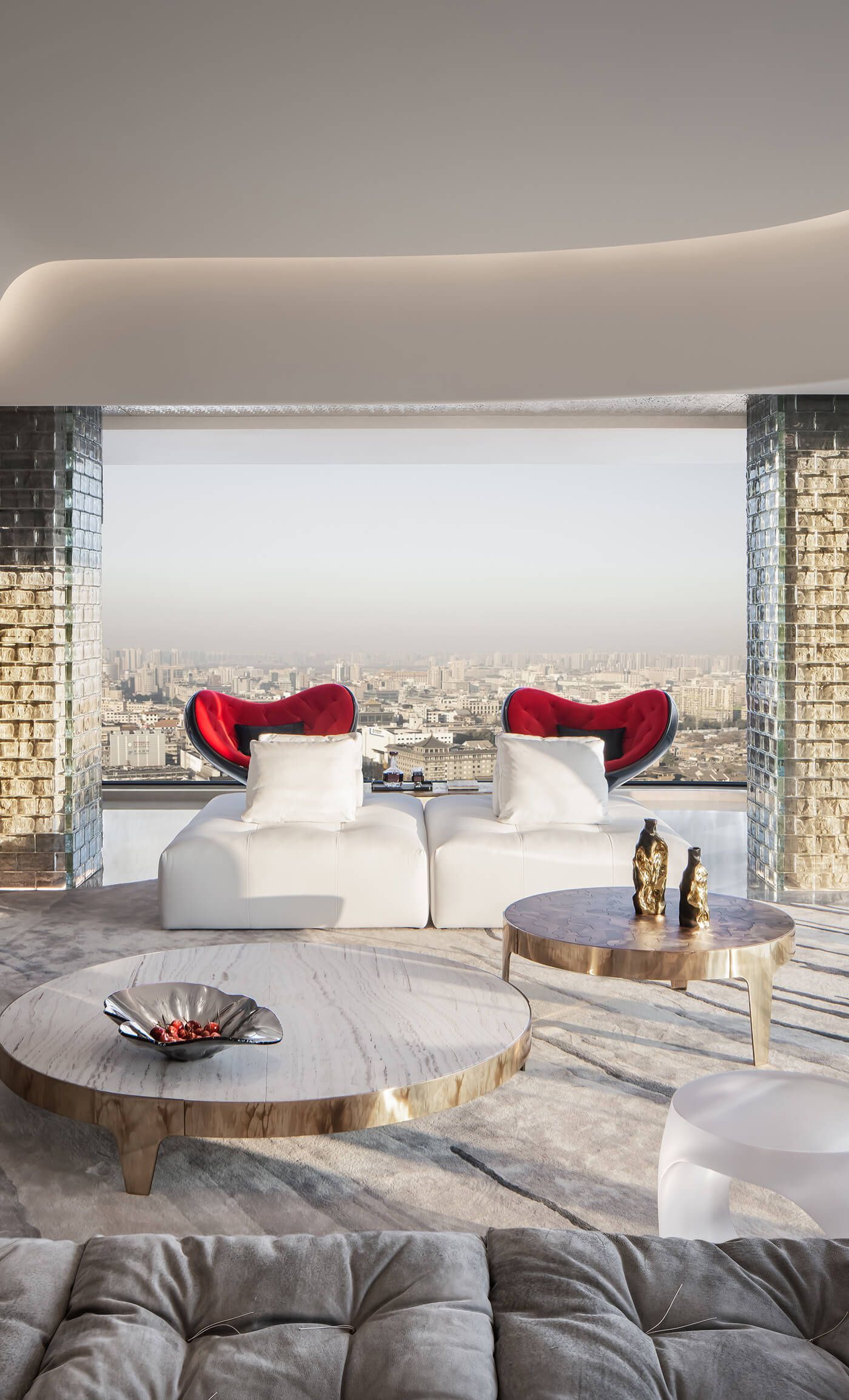
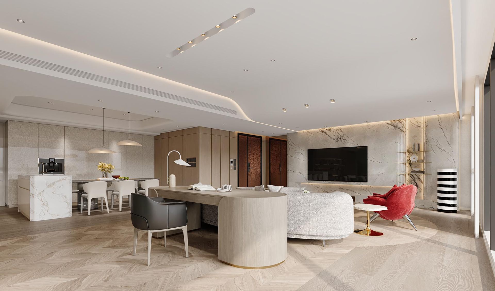
Comparing images from different projects makes this easier to understand than looking at just one. The curved ceiling and living area at Guande Roosevelt convey a sense of flow through more understated materials and furnishings. By contrast, the cover imagery for Unit A at Xi’an Yongshan Fu offers a more vivid expression of decoration and furniture. Neither is presented as a better style; together, they show that even when both designs prioritize proportion and sightlines, they need not lead to the same visual result.
Before choosing curves, symmetry or streamlined forms, first ask what problem they’re meant to solve—whether they give a large space a focal point, connect different areas or reflect the homeowner’s preferred atmosphere. Repetition without a clear purpose can easily reduce “style” to mere decorative motifs.
05 | When Personal Taste Conflicts with Practical Use, How Do You Preserve the Desired Atmosphere?
Good design decisions often come into play when a natural choice cannot be applied as is. For example, the homeowner may love how a rug defines a space, while the floor needs to remain as level as possible; or they may want the feel of a garden at home, but indoor planting that requires a lot of care may not be practical. Simply saying “it can’t be done” can make the feeling they wanted disappear, too.
The design discussions for Yuanta Jinghua offer a practical example. To keep the floor level, the living room is not defined by a thick rug. Instead, different wood finishes and parquet patterns create visual zones. The homeowners’ love of gardens is expressed in part through green walls, petal-shaped details and organic forms, while the plants that require tending are placed on the balcony.
Here, the designer isn’t choosing a “more practical style” for the homeowner. Instead, they unpack the feelings behind the homeowner’s preferences and find a spatial solution that brings them to life. The finished design should be judged by more than its appearance; it should also answer the question: how has this choice changed the way the space is used?
Planning your own home? Start by asking yourself these four questions
- From the entrance to the main seating area, what catches your eye first? If every object stands out equally, it may be time to rethink the visual hierarchy.
- Which materials should form the backdrop, and which need only serve as accents? Before ordering materials, it’s best to consider the walls, furniture, flooring and lighting together from the same viewpoint, rather than reviewing samples individually.
- From where will the artwork be viewed? Consider different vantage points—standing, sitting, and walking—and pay attention to the scale of nearby furniture and the negative space around it.
- If a favored form does not suit everyday life, is there another way to preserve the same feeling? For example, use a change in flooring instead of a rug to define zones, or express nature through abstract forms rather than forcing the original approach.
There is no one-size-fits-all answer to these questions for every home. They help turn what you “like” into spatial criteria we can discuss, rather than leaving it at the level of reference photos.
A cohesive whole isn’t about a uniform style; every choice has a reason.
A design style can be a point of reference, but it should never replace thoughtful consideration of the space. When materials have a clear hierarchy, art has a considered vantage point, curves respond to proportion, and furniture supports the way people live, different elements can still come together in a cohesive home.
A home designed for long-term living need not make every corner look like it belongs in the same style photograph. What matters more is that homeowners understand why each piece is here, why a material is used in a particular place, and how these choices come together to shape a home.
FAQ|Frequently Asked Questions
Q: Will using different materials make an interior look cluttered?
Not necessarily. The key is to establish a relationship between primary and supporting materials, and see how their textures, reflections, and color intensity respond to light—not to make every material identical.
Q: Should you choose artwork after the renovation is complete?
If artwork is a key visual focal point, it’s best to consider its size, viewing position, lighting, and surrounding furniture during the design stage. It can certainly be selected later, but the options for scale and placement may be more limited.
Q: How can an interior have a distinct style without feeling like a show home?
Beyond reference images, consider everyday objects, storage, family interactions, and how people reach for things and move through the home. A design’s ability to accommodate real life determines whether it will remain comfortable and cohesive after completion.